
Resume Formatting Basics: Layout, Structure, Length, and ATS Compatibility
The one-page rule is an early-career default, not a universal ceiling. Career stage and relevant experience guide length. Employer instructions take priority.
Overview
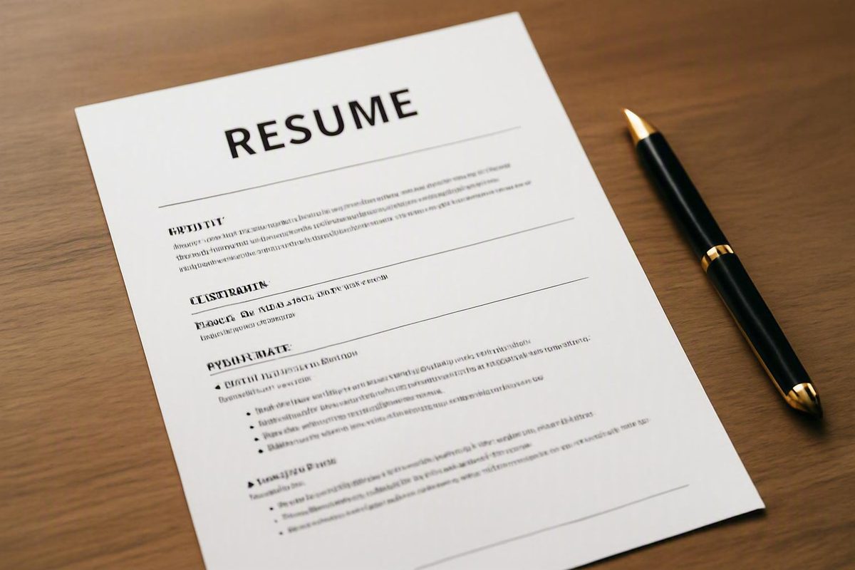
A well-formatted resume uses a basic font such as Calibri, Arial, Georgia, Garamond, or Times New Roman at 10–12 points, one-inch margins, a simple single-column layout, and clearly labeled sections in reverse-chronological order, per CareerOneStop’s resume guide. Length depends on your experience: one page for most early-career applicants, two only when your background genuinely requires it.
Before adjusting anything, it helps to recognize that “formatting” actually covers two separate decisions. The first is your organizational format — whether the document is chronological, functional, or a combination of the two, which determines how your information is organized. The second is your visual layout — fonts, margins, spacing, headings, and emphasis, which determines how the page looks. CareerOneStop identifies the three organizational formats as distinct choices, while Indeed’s format guide notes that each format “organizes information differently and may suit different career situations.” Changing your font does not change your format; the two choices are made independently, and this guide handles them in separate sections.
Here is the compact baseline most job seekers can start from:
- Font: Calibri, Arial, Georgia, Garamond, or Times New Roman, 10–12 points
- Margins: one inch on all sides as the starting point
- Layout: single column, left-aligned body text
- Headings: clear, consistently styled section labels
- Bullets: short, achievement-focused lines under each role
- Order: most recent items first within each section
One scope note before the details: this guidance reflects conventional professional resumes for standard applications. Yale’s Office of Career Strategy notes that longer documents and different conventions apply to research positions, performing arts, and advanced-degree candidates, and country and industry norms vary. Whenever an employer, application system, or sector gives specific instructions, those instructions supersede every default in this article.
Start with readable visual defaults
The safest visual choices are the ones that make the page easy to scan in seconds. As CareerOneStop puts it, your resume should be “easy to read, emphasize the most important information, and leave a positive impression” — every setting below serves that goal, and that goal decides ties whenever numeric advice conflicts.
Fonts and size. Use a basic, professional typeface — CareerOneStop lists Calibri, Arial, Georgia, Garamond, and Times New Roman — sized at 10–12 points, a range Yale’s Office of Career Strategy also endorses. Indeed’s guide adds a practical way to choose within that range: if your resume is short and you’re trying to fill space, use a 12-point font; if you have a lot of content, start at 10 points and increase it if space allows. Whichever you pick, apply it consistently. Purdue OWL’s resume design guidance recommends using no more than two fonts in a resume, applied consistently — for example, one for all headings and one for all body text.
Margins. One inch on all sides is the readability-forward starting point; Indeed calls one-inch margins the standard for resumes and other professional documents. If you genuinely need more room, Indeed’s guidance permits reducing margins to 0.75 inches, keeping them at or above 0.5 inches — and warns that text extending beyond 0.5-inch margins is often cut off when the file is converted to PDF or processed by an ATS. Treat the half-inch figure as a hard floor, not a target: numeric advice varies across sources precisely because the real rule is that the page must stay legible, and shrinking whitespace to cram in content defeats the purpose.
Alignment, whitespace, and balance. Left-align body text, since it is the easiest arrangement for reviewers to read; Indeed notes that if you center anything, limit it to your name, contact information, and headline. Purdue OWL adds a useful mental model: readers process a balanced page — roughly equal text and whitespace — from left to right and top to bottom, and the top-left area is read first, so your most important information belongs there.
Emphasis. Bold, capitalization, and italics create emphasis, but Purdue OWL cautions against mixing or overusing them — combining capitalization, italics, and underlining on the same text makes it harder to read, and overuse trains the reader to ignore what you meant to highlight. Reserve bold for section headings, employer names, and job titles, and be consistent about which element gets which treatment. As Harvard’s career services guidance summarizes, consistency in format and content is the underlying rule.
A quick way to test the result: Purdue OWL suggests a twenty-second read test — have someone scan your resume for twenty seconds, then ask what they learned. If the answer matches what you want an employer to know, your formatting is working. That matters because, per Purdue OWL, employers typically spend at most thirty-five seconds on an initial look at a one-page resume.
Choose the right organizational format
Separately from how the page looks, you need to decide how your information is organized. CareerOneStop identifies three basic resume formats — chronological, functional, and combination — and Indeed confirms these are the three primary formats job seekers use, each suiting different career situations. No single format is preferred by every employer; the right choice depends on your work history and what you need the first impression to communicate.
A chronological format emphasizes your work history, listing roles most recent first. CareerOneStop calls it a good choice for applicants with a solid work history who are staying in the same field. A functional format organizes the document around skills rather than a dated job history, which can foreground transferable abilities — but it de-emphasizes when and where you worked, and CareerOneStop’s ATS caution concerns visual layout rather than organization: it recommends avoiding tables, text boxes, logos, columns, images, and graphics, which ATS software may scramble — advice that applies to any format, functional included. A combination format includes a summary section at the top, may include a skills section, and still provides a detailed work history; CareerOneStop notes it “works well for most people” because it lets you lead with skills without hiding your timeline.
The table below maps each format to the scenarios where it tends to fit and the tradeoffs to weigh before committing.
| Format | What it emphasizes | When it may fit | Meaningful limitations |
|---|---|---|---|
| Chronological | Work history, most recent role first | Solid, continuous work history; staying in the same field | Puts gaps and short tenures in plain view; least flexible for repositioning |
| Functional | Skills grouped by theme rather than by job | When transferable skills matter more than job titles | Obscures the dated work history employers expect; Obscures the dated work history employers expect |
| Combination | Summary and skills up front, plus a detailed work history | Career changers and broad skill sets; works well for most people (CareerOneStop) | Longer than a pure chronological resume; requires more editing to avoid repeating content |
For career changers specifically, the common advice to “go functional” deserves scrutiny. A functional layout does let you lead with transferable skills, but stripping out the detailed history removes the context employers use to verify those skills, and stripping out the detailed history removes the context employers use to verify those skills. The combination format resolves this tension: you still open with a summary and skills section that reframes your experience for the new field, while the detailed reverse-chronological history underneath keeps your record verifiable. If you are considering a functional resume, first ask whether a combination format achieves the same repositioning without the downside.
Whatever you choose, remember that this decision is independent of your visual settings. A chronological resume and a combination resume can — and should — use the same fonts, margins, and heading styles described earlier.
Build recognizable sections in a logical order
Employers scan resumes quickly, so your sections should be ones they instantly recognize. Indeed’s format guide lists the standard building blocks: name and contact information, a summary or objective, professional history (most recent first), education, and skills, plus optional sections. The University of Michigan Career Center confirms the same core set for students — name and contact information, an optional summary (more common among experienced professionals but open to anyone), education, experience, and optional skills.
Within every section that contains dated entries, use reverse chronological order — most recent first. Both Michigan’s Career Center and Yale’s Office of Career Strategy state this directly, and it is what reviewers expect regardless of career stage. Under each role, write concise, achievement-focused bullets rather than dense paragraphs. Indeed adds a practical threshold: if a section has fewer than three pieces of information, skip the bullets and write the content as sentences instead — one or two lonely bullets look thinner than prose.
A typical sequence looks like this, though the right order for you depends on your strongest qualifications:
NAME AND CONTACT INFORMATION
SUMMARY (optional)
EXPERIENCE (most recent first)
EDUCATION
SKILLS (optional)
Treat this skeleton as a starting point, not a mandate. A current student or recent graduate usually places education above experience because it is the stronger credential; an experienced professional does the reverse. Michigan’s guidance also notes that the experience section is often split into two or three themed sections — common headings include Work/Professional Experience, Clubs/Student Organizations, Leadership Experience, and Service/Community Involvement — which lets you group related activities without inventing unfamiliar labels. The principle behind every variation is the same: lead with what best qualifies you for this role, keep headings recognizable, and keep entries in reverse chronological order within each section.
Choose length by audience and relevant experience
There is no universal page count — the honest answer depends on your career stage and how much relevant material you have. The University of Michigan Career Center advises most undergraduates to keep the document to one page, and CareerOneStop frames the general range as one to two pages, with a second page used only when your amount of experience makes it necessary.
Degree level and application type shift the default upward. Yale’s Office of Career Strategy states that resumes can run one to two pages for master’s students and up to two to three pages for PhDs and postdocs, and that longer documents may be appropriate for research positions or applications within the performing arts. In other words, the “one page” rule is an early-career default for conventional applications, not a ceiling that applies to every reader of this article.
The decision framework is straightforward: start from the default for your career stage, then let relevance — not total history — determine whether you exceed it. A second page earns its place only when it contains material a hiring manager for this specific role would want to see. What you should never do is fake a shorter resume by shrinking the type or margins until the page becomes hard to read. The supported ranges exist for a reason: 10–12 point text and margins no smaller than half an inch keep the document legible, and Georgetown’s career center guidance makes clear that tailoring content to the job description — trimming what does not match — is the legitimate way to control length. If your draft will not fit its target length at readable settings, cut the least relevant content rather than the whitespace.
Make the structure ATS-conscious without sacrificing readability
Many employers route online applications through applicant tracking systems (ATS) before a person reads them, so it is worth formatting with both audiences in mind. The good news is that the two audiences mostly want the same thing. But be precise about what these practices achieve: they improve compatibility with common systems; they do not guarantee that any specific ATS will parse your resume correctly or that your application will be selected.
Some choices are primarily about human readability — font selection, emphasis, whitespace balance, and the quadrant-style page layout discussed earlier. Others are specifically ATS-sensitive. CareerOneStop explains that ATS systems scan resumes left to right, so a simple, single-column layout helps your resume be read accurately, and it recommends avoiding tables, text boxes, logos, columns, images, and graphics because an ATS may scramble that content. If a decorative element carries information — an icon standing in for the word “Email,” a skills chart in place of a skills list — the information may simply disappear from the parsed version. Standard, recognizable section headings serve the same purpose: software (and skimming humans) can locate “Experience” and “Education” without guessing.
The overlap between the two audiences is a useful sanity check. One external guide summarizes it as a rule of thumb: if a document is easy for a human to skim, it is usually easier for software to parse — clear headings, readable font sizes, and whitespace between sections benefit both. If you find yourself choosing between a visually elaborate layout and a plain one, the plain one is the lower-risk default for online applications.
Keywords deserve equal care. Georgetown’s career center recommends comparing your resume to the job description and asking whether there are action verbs or key terms the employer uses that you can authentically apply to your own experience. The word “authentically” is the operative constraint: Georgetown explicitly warns not to game the system by overusing keywords where they do not belong, because your application could be removed from consideration. Mirror the employer’s terminology where it genuinely describes what you did — nothing more.
Run a final formatting and submission check
Before you submit, run the finished document through a short preflight check. Formatting errors introduced at the last step — a scrambled PDF conversion, a typo, a file named “resume_final_v3” — can undo careful work, and every item below is quick to verify.
- Check consistency across the whole document. Confirm that fonts, heading styles, spacing, date formats, and bullet punctuation match everywhere; Harvard’s guidance makes consistency in format and content the baseline standard.
- Have other people proofread it. The Headhunters’ resume formatting guide advises having several people review your resume for spelling and grammatical errors — and not relying on spell-check alone.
- Verify the reading order. Skim the document top to bottom and confirm the content reads in a logical sequence with clearly separated sections, since that is the order both a reviewer and an ATS will follow.
- Confirm your terminology is authentic. Recheck the job description one last time; per Georgetown, the language should match your real experience, not pad the keyword count.
- Re-read the employer’s submission instructions. File type, length limits, and required content in the posting override every default in this article.
- Save in the right file format. CareerOneStop advises saving and sending your resume as a PDF to preserve formatting — unless another format is specified. If the employer asks for a Word document, send a Word document.
- Review the converted file. Open the exported PDF and confirm nothing shifted, wrapped oddly, or dropped out during conversion before you attach it.
- Name the file descriptively. CareerOneStop suggests a file name that includes your full name, or full name plus job title, such as
Sarah-Smith-Marketing-Coordinator.pdf; The Headhunters gives the same advice with the simpler pattern “Mary Smith Resume.” A recruiter saving dozens of files should be able to find yours by name.
If every item checks out, the document is ready. You have made two deliberate, separate choices — how the information is organized and how the page looks — sized the document to your career stage, kept the structure friendly to both human reviewers and application software, and verified the file itself. That is the whole job of resume formatting basics; from here, the quality of the content does the rest.