
Business Card Layout Guide: From Printer Template to Final Preflight
Your printer's current template overrides any generic measurement found online. Five stages carry the card from document setup to a final preflight.
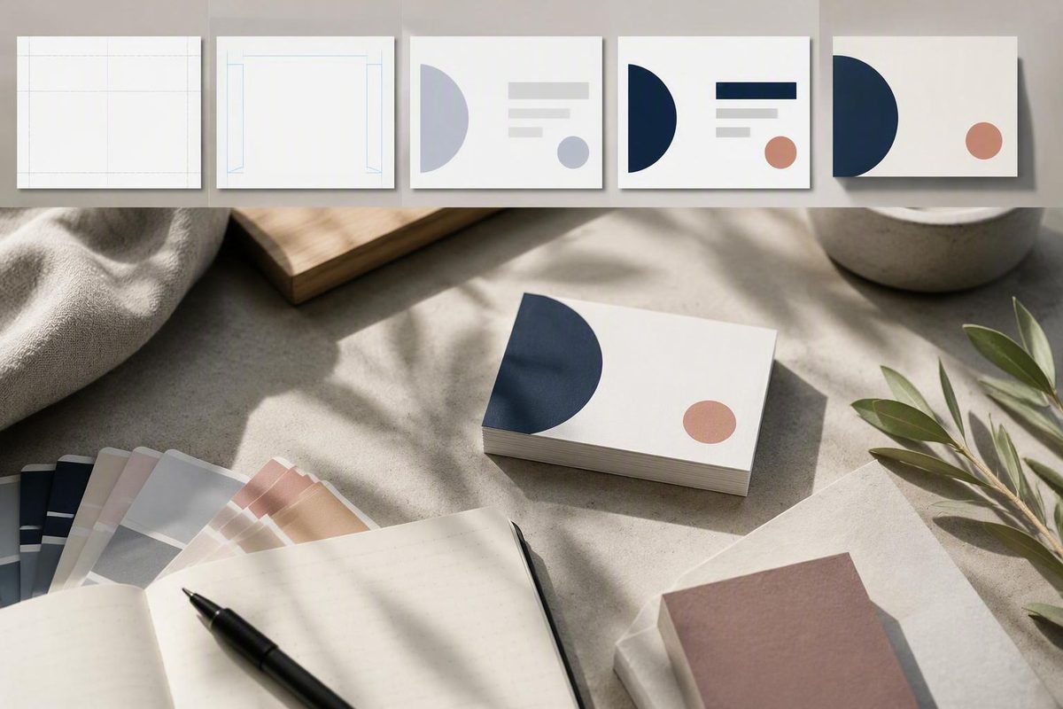
Overview
Lay out a business card in five stages: confirm the finished size and production specifications from your chosen printer, decide which information earns space, build a reading hierarchy from primary identity down to contact details, give the front and back distinct jobs, and run a disciplined preflight before you export. The single most important rule is that your printer’s current template overrides any generic measurement you find online.
That last point matters because the numbers you see repeated across design guides are conventions, not universal requirements. A 3.5 × 2 inch trim size is the common United States example, while 85 × 55 mm is the common European example, and individual printers set their own bleed, safety-area, and file rules on top of those formats. The guide from 4over4 puts the design problem plainly: the biggest text should be your name or company, the title one step down, and contact details the smallest readable size. The rest of this guide walks that sequence in order, from document setup through the final export checklist, so you can move from a blank canvas to a file your printer will accept without a reprint.
1. Choose the finished size and printer template
Start by deciding the finished (trim) size and orientation, then download or request the template your specific printer publishes for that format. This decision controls everything downstream: the document dimensions, where backgrounds must extend, and where text must stop.
Two sizes cover most of the market, and they are regional conventions rather than a single worldwide standard. Adobe Express describes 3.5 × 2 inches with a horizontal layout as the standard dimensions for most business cards, and 4over4 identifies 3.5 × 2 inches as the standard size in the United States, noting that this trim size is your final canvas after cutting. The designer resource at 99designs lists 85 × 55 mm as the standard dimensions in its guidance, which reflects the format common across Europe. The size reference at Kapa99 lays both out side by side: 3.5 × 2 inches (88.9 × 50.8 mm) for the US and Canada, 85 × 55 mm for Europe and much of the world, and 85.6 × 53.98 mm for the ISO credit-card format that fits a wallet slot. Pick the size your recipients and printer expect; do not treat either regional example as universal.
Once you know the size, get the printer’s template before you place a single element. Printers such as PsPrint publish downloadable layout templates that carry the exact trim, bleed, and margin guides their production line uses, and those files exist precisely because generic measurements drift from real production tolerances. Templates become non-negotiable for anything nonstandard: custom shapes, die cuts, folded cards, and special finishes all require printer-specific specifications. As a bounded practical point, an unconventional shape also tends to reduce the usable rectangle available for text, so budget less content for a shaped card, not more.
Distinguish trim, bleed, and safety area
A print-ready card file has three nested boundaries, and confusing them is the most common setup error. The trim line is where the card is physically cut. The bleed is extra background that extends past the trim so the blade never exposes a white sliver. The safety area is an inner margin where all text and logos must stay so nothing critical gets clipped when the cut varies slightly.
The table below shows two documented examples, one US and one metric. Treat every number as an example that your printer’s template can override.
| Boundary | US example (Kapa99) | Metric example (Fineline Print & Web) | What it does |
|---|---|---|---|
| Bleed (outer) | 3.75 × 2.25 in document, 0.125 in past each edge | 91 × 61 mm artwork, 3 mm bleed all round | Backgrounds and full-bleed colors must extend to here so cutting never leaves a white edge |
| Trim (cut line) | 3.5 × 2 in | 85 × 55 mm | The finished size the card is actually cut to |
| Safety area (inner) | Text kept roughly 0.125–0.25 in inside the trim | Artwork kept at least 5 mm from the edge in the Sheffield Hallam print shop template | Everything you cannot afford to lose, all text and logos, stays inside this zone |
Even these safety margins disagree between vendors: 4over4 tells designers to keep every logo and line of text at least 0.125 inches inside the trim line, while the Sheffield Hallam University print shop template recommends 5 mm, which is closer to 0.2 inches. That spread is exactly why the printer’s own template, not a generic figure, should set your guides. Set up the document at the bleed size with visible trim and safety guides before you design anything.
2. Decide what information earns space
Before arranging anything, decide what belongs on the card at all. Brandly’s design rules state the core constraint directly: the purpose of a business card is to quickly transfer contact details, and overloading it with too much information just creates clutter. On a surface of roughly 3.5 × 2 inches or 85 × 55 mm, every field you add takes readability from every field already there.
Adobe Express defines the essential set simply: your name, company, company logo, email address, and phone number, with a physical office address as an option to consider rather than a default. Everything beyond that set is conditional, meaning it earns space only when the card’s purpose and recipient justify it.
A practical way to sort your draft content:
- Essential: name, company name or logo, one phone number, one email address
- Conditional: physical address, website URL, one social handle, a tagline, a QR code, a short call to action, a portrait or product image
The deciding question for each conditional field is the recipient. Brandly’s guidance is to think about who you will hand the card to and design with their preferences and expectations in mind. A tradesperson whose clients visit a physical shop probably needs the address; a remote consultant probably does not. A photographer may justify a QR code linking to a portfolio; an accountant may not. If a field does not change what the recipient can do next, it is decoration, not information.
When the layout starts to feel crowded, the correct response is removal, not compression. The 4over4 formatting guide is explicit on this point: when the layout feels tight, edit the content rather than the spacing. Shrinking margins and type to preserve a marginal field trades away legibility, which is the one quality the card cannot lose. Lock your final field list before you open the layout file, and treat any later addition as a trade that must displace something else.
3. Create the reading hierarchy and brand system
With the content list fixed, arrange it so a stranger’s eye follows a deliberate path. Vistaprint’s design rules quote designer Tristan on the standard flow: a good visual flow for a business card should start with the logo, then the name, then move on to secondary information like email addresses and phone numbers. The 4over4 guide expresses the same structure through size: your name or company name should dominate as the biggest text on the card, your title or tagline sits one step down, and the contact details stay the smallest readable size. Three tiers, three type sizes, one path.
Typography choices carry that hierarchy. 4over4 recommends sticking to two typefaces at most, one for headings like your name and company and one for body details, warning that three or more fonts on a surface this small reads as chaos. AlphaGraphics adds the selection criterion: choose fonts that are legible and reflect your brand’s personality, and avoid overly decorative or hard-to-read faces. Contrast does similar work at the color level. Adobe Express notes that the font needs to be large enough to read and in colors that make the text stand out against the background; a low-contrast pairing that looks refined on screen can fail in the hand.
The brand system should constrain these choices rather than compete with them. Adobe Express advises keeping brand guidelines top of mind for color, font, and logo use so the card matches the rest of the identity, and it credits negative space (white space) with making a design look clean, professional, and pleasing. None of this prescribes one visual style. A law firm and a tattoo studio can both follow the same hierarchy with completely different type, color, and spacing decisions. The hierarchy is the fixed structure; the brand supplies the surface.
Use 8pt as a conservative baseline, then test the actual typeface
Design guides disagree on the smallest acceptable text size for a business card: some treat 7pt as an absolute floor, while others set the minimum at 8pt. When sources conflict, the conservative choice is the safer default, so set contact details no smaller than 8pt unless you have a specific, tested reason to go lower.
Treat that number as a starting point, not a guarantee. Point size is a nominal measure, and two typefaces at the same size can differ noticeably in apparent height, stroke weight, and openness. A light-weight face at 8pt on a low-contrast background can be harder to read than a sturdier face at 7pt in solid black. Weight, letterspacing, and the contrast between text and background all shift the practical limit.
The only reliable evaluation is looking at the type at actual printed size rather than zoomed in on screen, where everything looks legible. Print a draft at 100% scale on whatever printer you have, or view an unscaled proof, and judge the smallest line in normal reading conditions. The supplied guidance does not establish a formal proofing protocol beyond this, so keep the test simple: if you have to bring the draft closer to your eyes to read the phone number, the type is too small or the face is wrong.
Adapt the layout to long or multilingual details
Long names, compound job titles, lengthy URLs, and bilingual contact blocks break tidy hierarchies faster than any other content problem. The fix follows the same priority logic as the rest of the card: protect the essential identity tier first, then make room by cutting, not by shrinking.
Apply the 4over4 principle that when the layout feels tight, you edit the content rather than the spacing. In practice that means removing conditional fields before touching type size or margins. A long personal name outranks a social handle; a long official job title outranks a tagline. Labels are another quiet source of width: where the format of a detail is self-evident, a bare number or address can work without a “Tel:” or “Email:” prefix, freeing a meaningful slice of a short line.
If the card carries details in two languages or scripts, the second side is the natural release valve. 4over4 recommends giving the back a job of its own, and carrying one language per side is a legitimate job that keeps each face clean instead of interleaving two scripts in half-size type. Brandly’s recipient-first rule applies here too: design for the language and expectations of the person receiving the card. What you should not do is collapse line spacing or drop below your tested minimum type size to force everything onto one face. A card that fits everything but reads poorly has failed at its only task.
Let stock and finish support legibility and brand tone
Paper and finish are layout decisions, not afterthoughts, because they change how the printed type behaves in the hand. Adobe Express frames the physical card as a branding opportunity: the type of paper, the thickness, whether the surface is matte or has a sheen, and whether lettering is embossed all say something about the brand before anyone reads a word.
The clearest functional guidance in the evidence concerns matte finishes. AlphaGraphics describes matte as ideal for readability on cards with lots of text, because it reduces glare and keeps text easy to read across lighting conditions. If your layout is text-dense, that points toward matte; if your design leans on large color fields or photography, discuss finish options with your printer rather than assuming any finish behaves the same across stocks.
Whatever you choose, Vistaprint’s rule applies: make sure special features are appropriate for your branding. A finish should reinforce the tone the layout already sets, not compensate for a weak one. Confirm that your chosen stock and finish are available in your printer’s template and pricing before you finalize the design, since some treatments change file requirements.
4. Assign distinct jobs to the front and back
Double-sided cards are common, and the productive way to use two sides is to give each one a distinct job rather than repeating the same details twice. Adobe Express notes that business cards are commonly double sided, with many people putting the company logo on one side and their details on the other. 4over4 goes further: give the back a job of its own, whether that is contact details, social handles, a QR code to a portfolio or booking page, or a bold brand pattern. Duplicating the same contact block on both sides spends your scarcest resource, space, on information the recipient already has.
Here is a wireframe you can copy into your layout file, with slots ordered by the hierarchy from section 3. Essential slots must be filled; conditional slots are filled only when section 2’s purpose test says they earn space.
- Front, slot 1 (essential): logo, positioned where the eye lands first
- Front, slot 2 (essential): name or company name, the largest text on the card
- Front, slot 3 (conditional): job title or tagline, one size step down — include only when it helps the intended recipient understand your role or the brand’s offer
- Front, slot 4 (essential): phone and email, the smallest readable tier, inside the safety area
- Back, slot A (conditional): QR code with a short label such as “Scan for portfolio”
- Back, slot B (conditional): website URL, social handle, or physical address
- Back, slot C (conditional): full-bleed brand color, pattern, or enlarged logo
You can shift the contact tier to the back if the front is a pure identity statement, as in the logo-front, details-back arrangement Adobe Express describes; the wireframe is a starting allocation, not a fixed law. Two constraints do hold. First, each detail should live on exactly one side. Second, a one-sided card is completely valid when the essential slots complete the communication goal; an empty or purely decorative back is not a requirement, and Brandly’s clutter warning argues against inventing content to fill it. If you do print both sides, remember that the back is a full production page: the Kapa99 size guide notes that a double-sided card needs its own print-ready page for the back with the same bleed and safe-area rules as the front.
Use the reverse side only when it adds a function
The decision rule for the back is functional: use it when it gives the recipient information or an action they would not otherwise have, and skip it when it would only echo the front. The 4over4 list of legitimate back-side jobs, contact details, social handles, a QR code to a portfolio or booking page, or a bold brand pattern, works as a menu. Each item either informs, enables an action, or deliberately reinforces the brand. “It came with two sides” is not on the list.
QR codes deserve their own test because they are the most frequently defaulted-to back element. A QR code earns space only when its destination gives the recipient something the printed card cannot, such as a portfolio, a booking page, or a saved-contact file. If it merely points at a homepage whose URL is already printed on the card, it duplicates information at the cost of visual noise. When a code does earn its place, follow the placement and sizing guidance in the evidence: Vistaprint suggests putting the code on the back so it is easy to scan and does not take attention from the logo on the front, and 4over4 recommends sizing it at least 0.75 × 0.75 inches so scanners read it reliably, with a short label underneath such as “Scan for portfolio” or “Save my contact.”
The same functional test covers a physical address (does the recipient ever visit?) and a call to action (is there a specific next step?). None of these elements is guaranteed to improve response, and no source in this guide’s evidence supports a retention or conversion promise for any of them. Add them for function, not for luck.
5. Export and run the final preflight
The preflight is where you separate objective production checks, which have right and wrong answers, from subjective brand preferences, which do not. Adobe Express states the stakes plainly: make any mistakes and you will be stuck with them for a while, especially on a large batch. Run every item below before you submit, and treat a single failure as a reason to fix and re-export, not to hope.
- Verify every character. Check the spelling of names, the digits of the phone number, and the exact email and URL. Vistaprint recommends asking a colleague or friend to double-check the card for spelling errors before you place the order; a second reader catches what the author’s eye skips.
- Confirm type and contrast at actual size. Recheck that the smallest tier meets your 8pt baseline from section 3 and that text stands out against its background, per the Adobe Express readability guidance.
- Check safety placement. Every logo and line of text sits inside the safety area, at least 0.125 inches inside the trim per 4over4, or at whatever margin your printer’s template specifies. 99designs warns never to place important information past the trim line, since it may be cut off during printing.
- Confirm bleed coverage. Any background meant to reach the card edge extends fully into the bleed zone, 0.125 inches in the Kapa99 US example or 3 mm in the Fineline Print & Web metric template.
- Avoid decorative borders. 99designs advises against borders because they often look lopsided after printing; even a small cutting variation turns a symmetrical frame into a visibly uneven one. Full-bleed backgrounds and borderless layouts hide the same variation.
- Check image quality and color mode. 99designs specifies saving files in CMYK color mode at 300 dpi, and AlphaGraphics warns that low-resolution graphics appear pixelated and unprofessional in print.
- Handle fonts safely. 4over4 identifies a high-resolution PDF with fonts outlined and images at 300 dpi as the safest choice for sharp, accurate printing, because outlined fonts cannot reflow or substitute on the printer’s system.
- Set up both sides correctly. For a double-sided card, the back is its own print-ready page with the same bleed and safety rules as the front, as the Kapa99 guide notes. If you built in a printer template, remove the guide layers; the Sheffield Hallam template instructs designers to delete the instruction layer before converting to PDF.
- Follow the printer’s export specification. File format, crop marks, and delivery method come from your printer’s current documentation, not from a generic list. When in doubt, ask before you upload.
Once every production item passes, the remaining decisions, color mood, finish preference, how bold the back should be, are brand judgment calls with no wrong answer. Keep those two categories separate in your head: taste is negotiable up to the deadline, but trim lines, resolution, and spelling are not. Submit the file, order a small proof run if your printer offers one, and check a physical sample before committing to a large batch.